• Advertising
  • Art
  • About
  • Connect
Menu

Viva Gallivan

  • Advertising
  • Art
  • About
  • Connect

COMPANY XIV Branding

Company XIV is a New York City Neo-Baroque performance troupe fusing opera, circus, live music, over-the-top design, cross-genre, and cross-gender artisans. Productions are a truly immersive theatrical experience. Costumes are extravagant, choreography tight, light and sound design skilled, titillating senses in a plush aromatic atmosphere. Company XIV is a vaudevillian masterful virtuoso, bold in both context and humor.

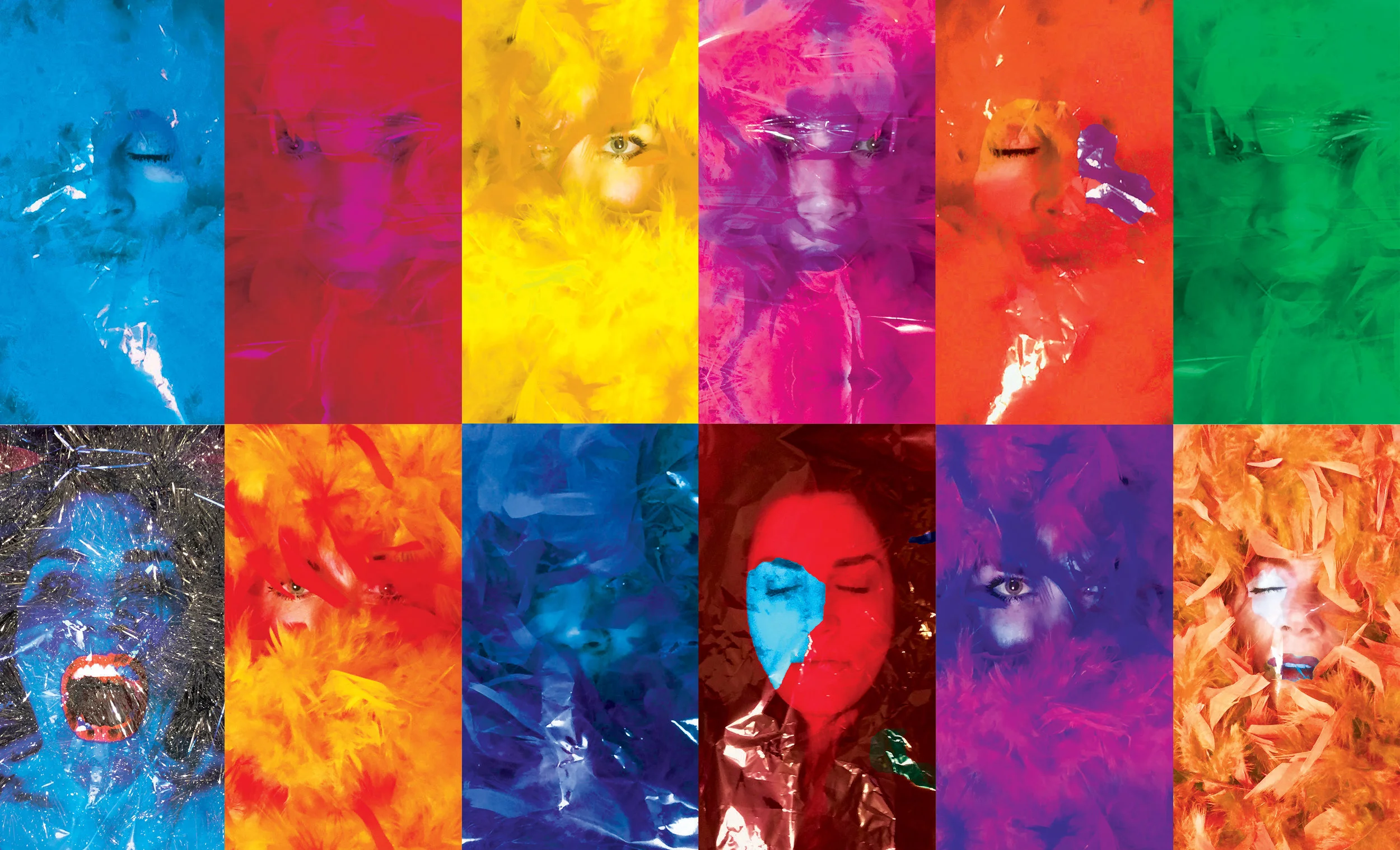
Capturing the true essence of these productions is best live and a redesign of Company XIV branding must leave more than it reveals. Focusing on eyes as windows into a world accessed only by imagination, branding design simply beckons a journey; a curiosity. I chose a modern typeface (Brandon Grotesque) as the architecture merging ancient & contemporary complexes. Eyes are the focus of each piece wrapped in typeface as if eyes are the stage and font the audience in their seats. Immersion of style connecting voyeurs to performers, this branding is the white rabbit of Company XIV. Vibrant modern colors visually pop a hidden underworld of beauty accessed only through the eye calling you to feed your head.

1.jpg
2.jpg
23.jpg
24 copy.jpg
25.jpg
26.jpg
27.jpg
28.jpg
29.jpg
30.jpg
31.jpg
32.jpg
33.jpg
34.jpg
35.jpg
36.jpg
37.jpg
38.jpg
39.jpg
40.jpg
41.jpg

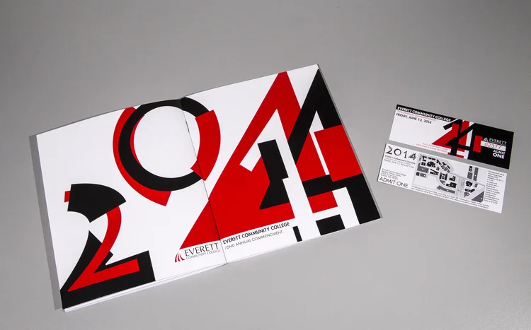
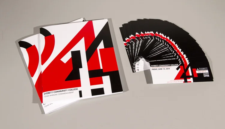
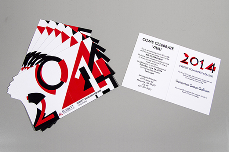
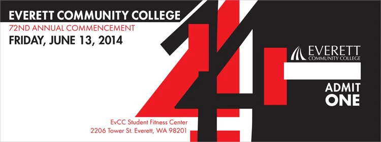
EvCC Commencement

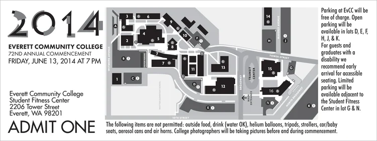
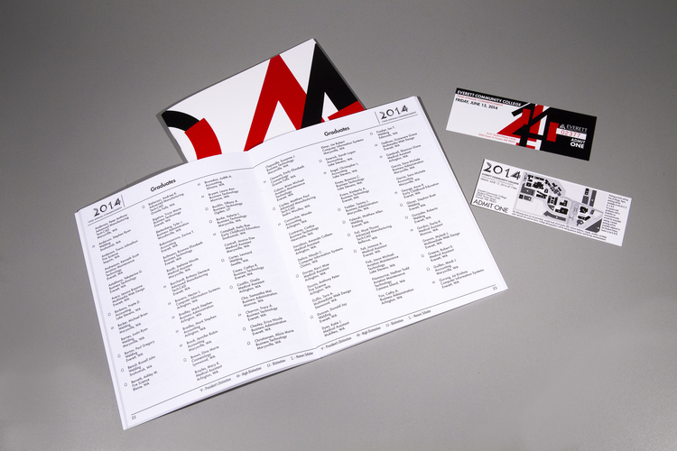
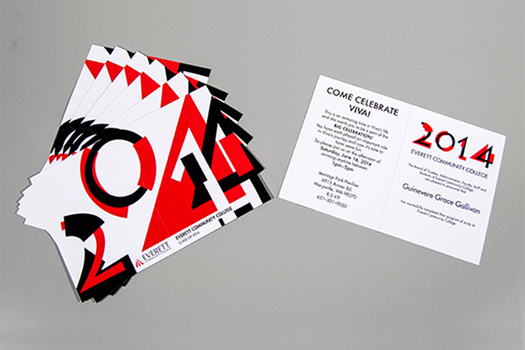
The Project: Everett Community College 2014 Graduation Commencement. 

The Process: I began by reading EvCC's style guide and created mood boards to present to 12 board members. We narrowed it down to 3 concepts and I went back to the drawing board. I presented the 3 mock-ups to the board and we made the final choice of my geometric design that left the viewer with an element of surprise. Once I knew the cover design I began working on the tickets and announcements to meet deadlines. I used a local printer for a fast turn around, completing the project way under budget.

static1.squarespace.jpg
static1.squarespace-4.jpg
evcc.png
static1.squarespace-2.jpg
static1.squarespace-3.jpg
static1.squarespace-1.jpg
EvCC.png

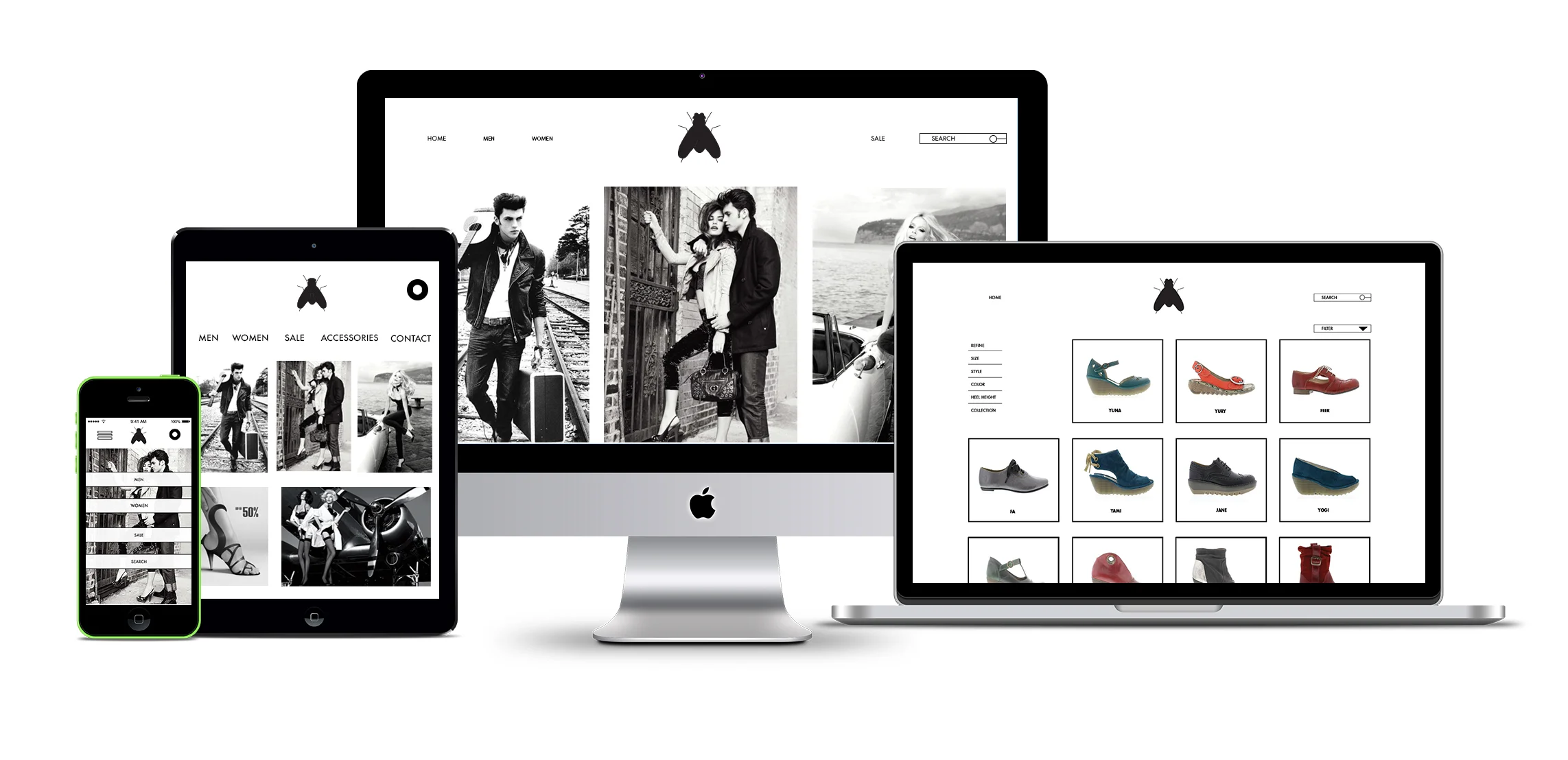
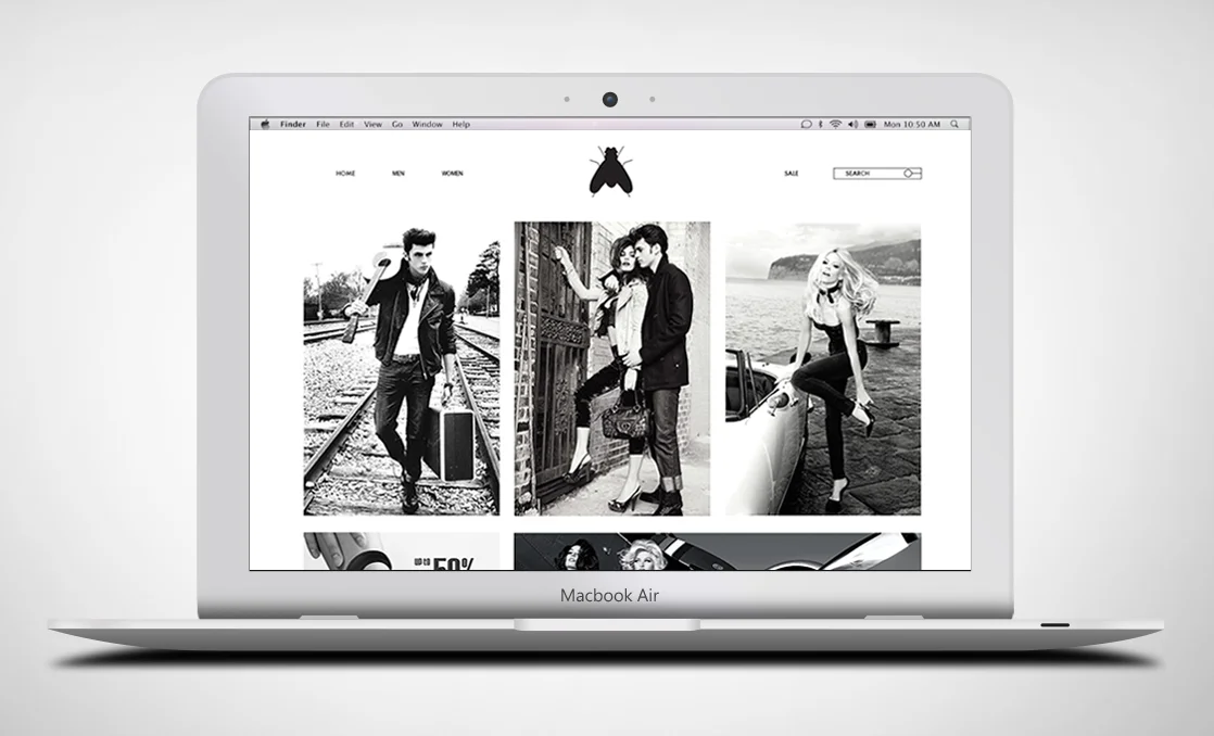
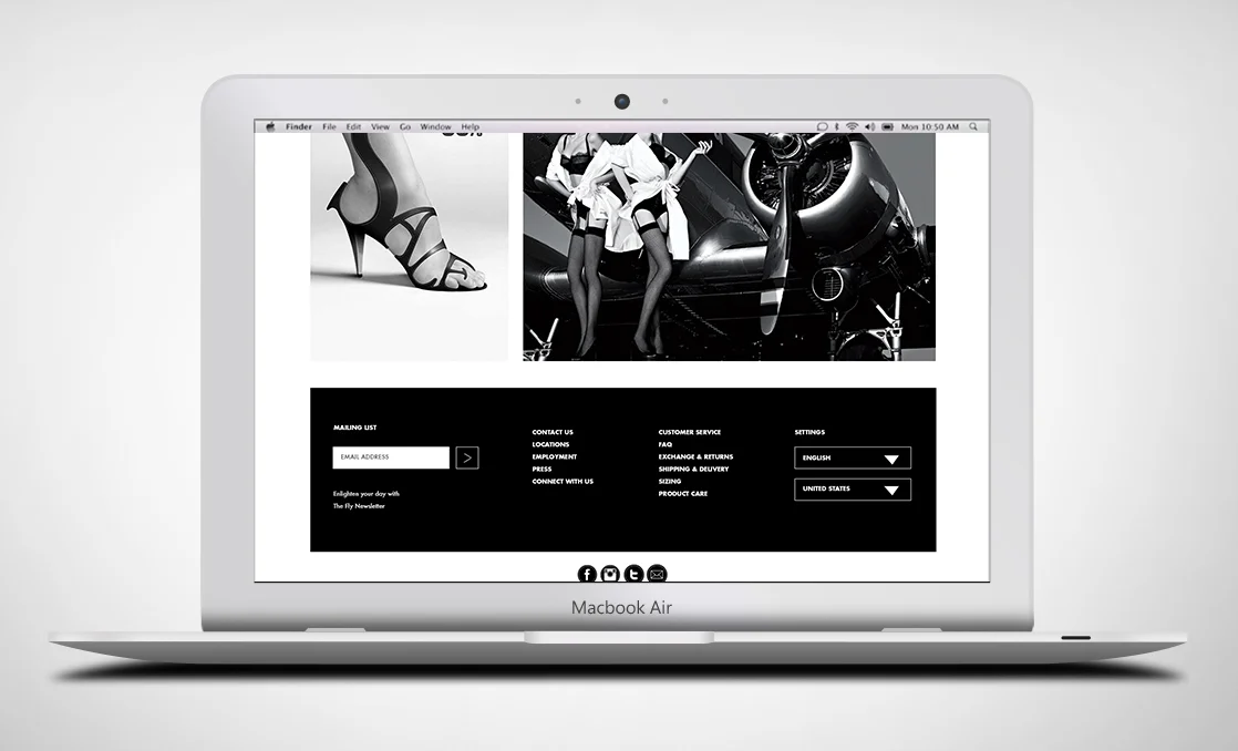
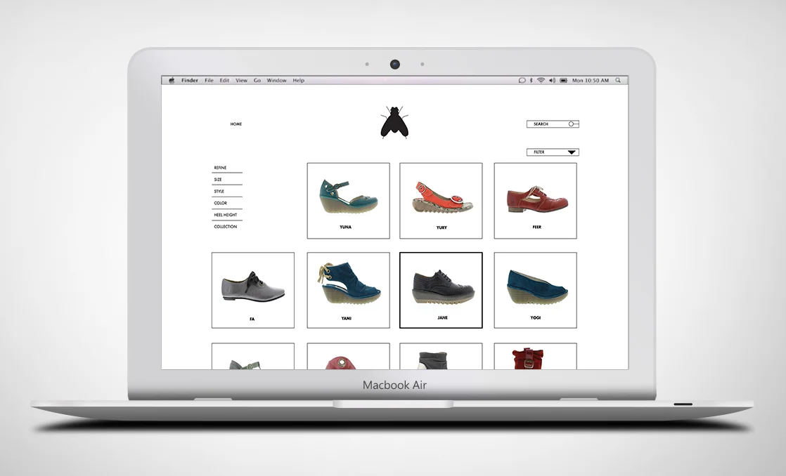
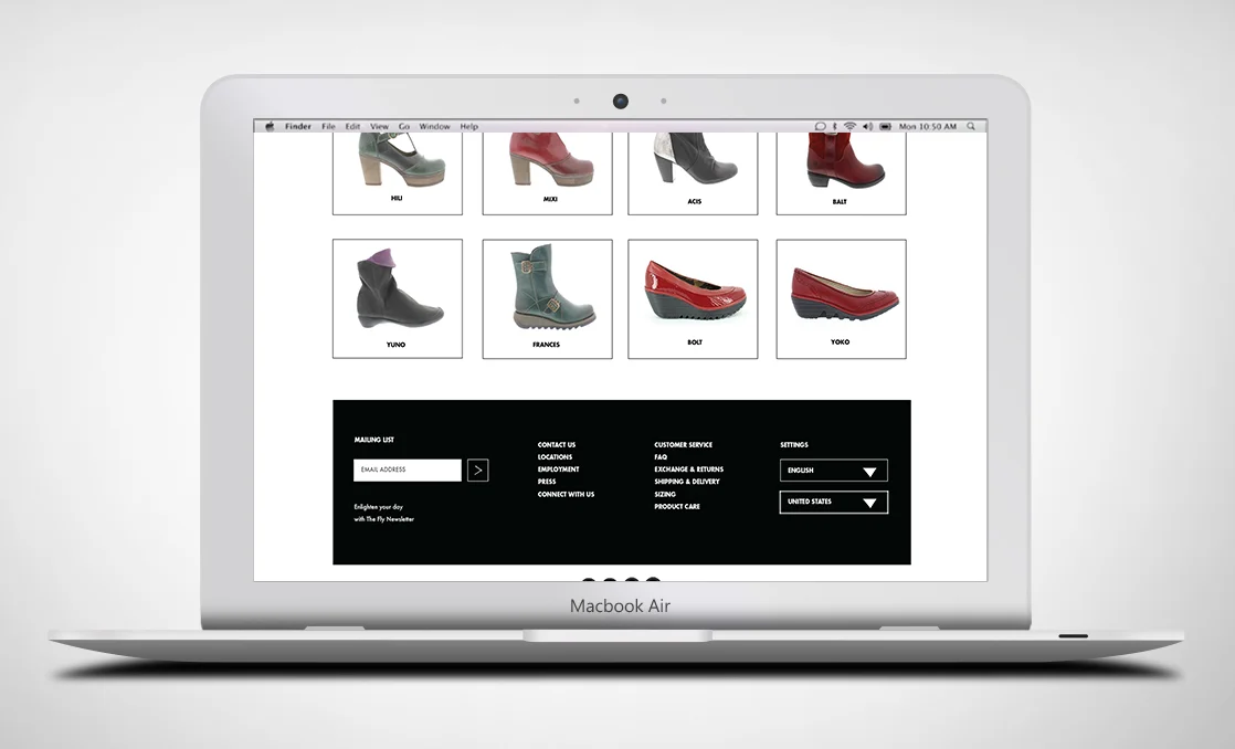
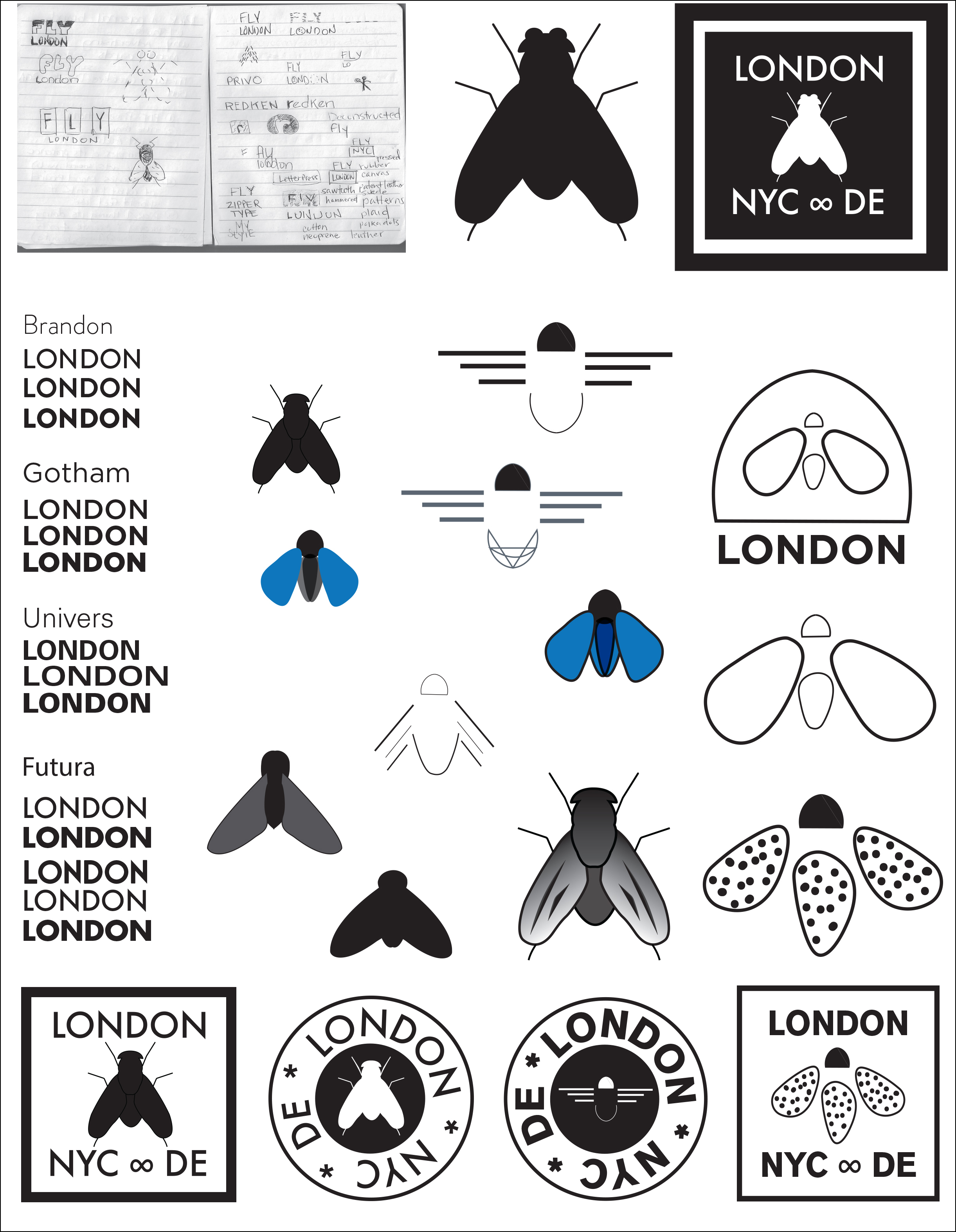
Fly London Branding & UX Design


Fly London is a life-style brand shoe company that I rebranded from their logo to designing their website and mobile site.


fly_london_responsive.jpg
fly_web1.jpg
fly_web2.jpg
fly_web3.jpg
fly_web4.jpg
static1.squarespace.jpg
static1.squarespace-1-1 copy.jpg

Pin-Up Artists - Typography, Branding and Package Design

I chose five famous pin-up artists to create a timeline with their lives interconnecting from their works being published by Brown & Bigelow. Brown & Bigelow is a publishing company located in St. Paul, MN. These artists worked for B&B through the various years of 1932–1960. I created each poster by collaging, painting and using typography to tell a short bibliography of the artist. Then I created packaging for the posters and the timeline to have as a set.

PinUp_Timeline_Final.jpg
2017_Portfolio147.jpg
2017_Portfolio151.jpg
2017_Portfolio152.jpg
2017_Portfolio153.jpg
2017_Portfolio155.jpg
2017_Portfolio160.jpg
2017_Portfolio156.jpg
2017_Portfolio159.jpg
2017_Portfolio161.jpg
2017_Portfolio165.jpg
prev / next
Back to Graphic Design
23.jpg
21
COMPANY XIV Branding
thumbnail_amecole.png
0
AmeEcole Branding & UX Design
star.jpg
0
StarBrite Colors Branding
Bulova_Military_Logo.jpg
0
Bulova Print & Digital
GM_Mag_V1.jpg
0
Goldmine Magazine Branding & Editorial Design
thumbnail_tidpunkt.png
0
tidp-unkt Branding & Product Design
ALPINA_LOGO.jpg
0
Alpina Print & Digital
42.jpg
0
The Animal Collection Typography & Branding
FC_LOGO.jpg
0
Frederique Constant Print & Digital
static1.squarespace.jpg
7
EvCC Commencement
fly_london_responsive.jpg
7
Fly London Branding & UX Design
2017_Portfolio146.jpg
11
Pin-Up Artists - Typography, Branding and Package Design

© 2026 Viva Gallivan, All Rights Reserved.